


Google has added a number of new PageSpeed Insights to help developers and webmasters better optimise their mobile websites it has confirmed.
In the Google Webmaster blog, Matthew Steele and Doantam Phan discuss the issue of site loading on mobile and how best to make a site as mobile and user friendly as possible.
They suggested: "Poor usability can diminish the benefits of a fast page load.
"We know the average mobile page takes more than seven seconds to load, and by using the PageSpeed Insights tool and following its speed recommendations, you can make your page load much faster."
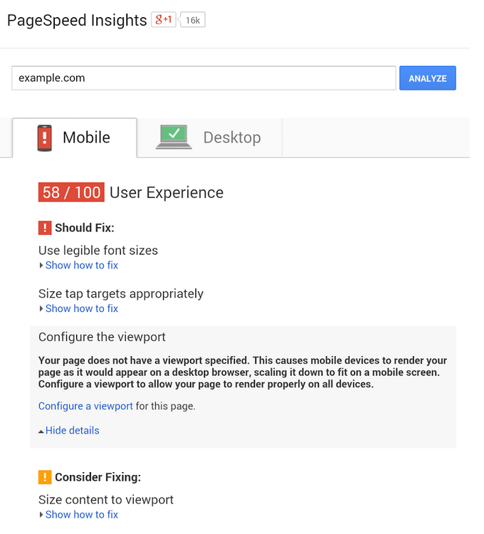
As seen in the image, Google PageSpeed for mobile recommendations currently discusses five major issues.
In the case of Configure the viewport it is suggested without the relevant meta-viewport tag the site will appear on modern mobile browsers as it would on a desktop. Here it is instead recommended to configure the viewport to width=device-width.
Size content to viewport is a similar consideration. This recommendation is a reminder mobile users will scroll a page vertically as opposed to horizontally.
Google then recommends you use legible font sizes. Obviously on a mobile page if you have to zoom in to even read the text it counterbalances the pageload speed - hence creating a poor user experience. PageSpeed Insights therefore checks the text is large enough for mobile.
Google's final two recommendations revolve around sizing tap targets appropriately and avoiding plugins. In the case of the former, it recommends making sure a site's touchscreen tap buttons are large enough to be pressed easily and in the later Google recommends steering clear of things such as Flash or browser plugins as many smartphones don't support them.
News brought to you by ClickThrough – experts in SEO, PPC Management, Multilingual Search Marketing and Website Conversion Enhancement services.

Let's be social
Join our growing social communities to learn more about the benefits of digital marketing and the people who make us tick.