


How often do you consider your website's CTAs? Matt Hitches explores 5 top tips for designing buttons.
You’ll struggle to find a website that doesn’t have any buttons or Calls to Action (CTAs). They are an essential part of any site, and are directly responsible for sales, leads and many other types of conversion.
In this article, I’ll address five key points to consider when designing buttons, helping you to unlock their full potential by improving user experience (UX) and boosting conversions.
What would a small increase in conversions look like to your business? What would a 1% increase mean to your revenue? If your website received 1,000,000 sessions per month and had an average order of £50, a 1% increase in conversions could generate an additional £500,000 revenue.
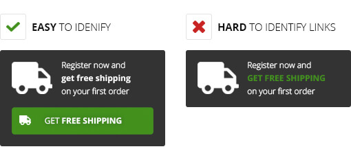
1. Including an icon
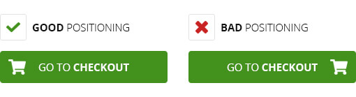
Including an icon is an easy way to enhance a button. A carefully-chosen icon can do more than just improve the design - research shows that the addition of an icon makes information easier to find when scanning a page - providing you chose the right icon and position it in the correct place.
We process visual content much quicker than words. To take advantage of this we should place the icon on the left-hand side of the button, in front of the text. This way it is the first thing the user sees.
2. Use colours consistently
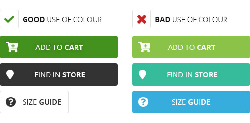
When designing for an interface with a lot of buttons, such as an e-commerce website, establishing a consistent colour for primary, secondary and tertiary buttons is a good way to sign post users and get them clicking where you want.
For an e-commerce website, using the primary buttons for View product or Add to cart will help users identify the key CTAs and make it easier for them to use the site.
As well as being consistent with colour, you also need to consider which ones to use. One standout colour for your primary CTAs is great way to sign post users - if you use a selection of colours across your site for different types of CTAs it may look nice, but could have a negative effect on UX and conversions.
The example below shows how using too many colours can confuse users and detract from your primary CTA.
3. Emphasise the right element
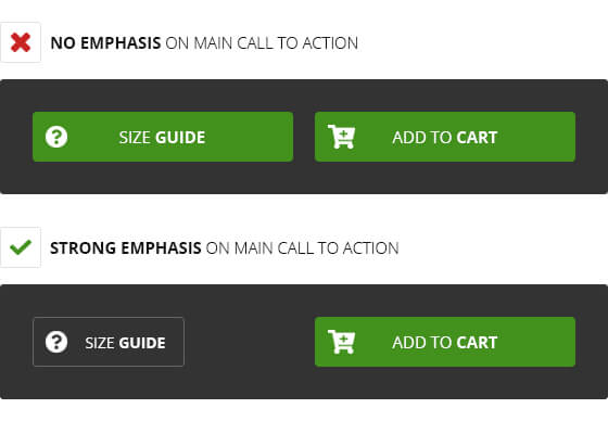
Good button design isn’t always about how the button looks itself, but how it contrasts to supporting or secondary elements.
A great example of this is an “Add to cart” button on a product page. You need users to interact with other elements on the page, but you also need to make it clear what the primary CTA is.
De-emphasising supporting elements is one way to achieve this. Reducing shadows or having a lighter / thinner border can help improve the contrast.
This idea also ties in nicely with using consistent colours. If a user knows to look for a certain colour button it’ll be much easier for them to find it and convert.
4. Consider the size across all devices
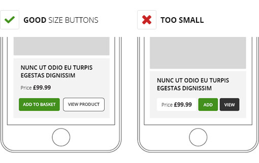
Gone are the days of simply designing for desktop. In 2018, anything and everything can be used to browse the internet, from your television to phone or watch, and we have to consider each of these devices.
As the mobile web continues to grow, we need to ensure that the CTAs and buttons we design are big enough for users to click, but at the same time don’t take up too much space.
It’s also important to consider the space between buttons and other clickable elements! If there isn’t enough of a gap a user may find it tricky to click the right element.
5. Make it look like a button
Seems like an obvious one, but it’s simple! Stick to conventional shapes when designing buttons - you can’t beat a good rounded rectangle…
A button or CTA is a key element on any page and it’s essential that users can recognise them. If you decide to use a text link or deviate from tradition and opt for an unusually shaped button, users may struggle to identify it, which will result in less clicks, and less conversions.
Conclusion
Good button design is vital when trying to create a great UX and boost conversions. Remember to use traditional shapes - consider the appearance on all devices and keep colours consistent, too. Also remember that icons are great for enhancing the look and overall UX, providing they are used correctly.
What next?
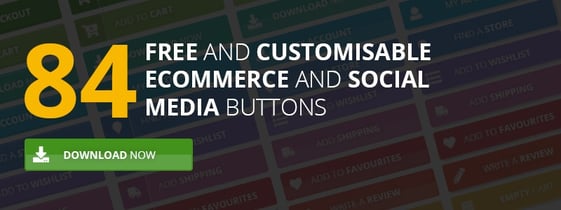
Need some examples of button designs for a top line UX? Our free button pack contains 84 easily customisable e-commerce and social media buttons, all of which have been created according to best practise and guided by the advice given in this article.

Let's be social
Join our growing social communities to learn more about the benefits of digital marketing and the people who make us tick.