


Dr Dave Chaffey reveals how a content marketing strategy can improve your search and conversion performance.
HOW CONTENT AUDITING CAN IMPROVE SEARCH AND CONVERSION
I concluded my last post, a round-up of organic search trends with the recommendation, that what matters at least as much as following the industry trends, is to understand your own trends in how successful you are with SEO and content marketing.
So in this article, I'll cover a practical approach to auditing your content to see what's working well and what could be working better. It's based on a visual mindtool I call the "Content Optimisation Matrix". It's the third in a series of mindtools including the Content Marketing Matrix and Content Distribution Matrix to support your strategic thinking on content marketing and SEO that I've developed with Smart Insights.
It can be applied to most types of business from niche B2B sites with a low-level of traffic and few pages to media and retail sites with many more pages.
Why Use The Content Optimisation Matrix?
If you dig into the Behaviour reports in Google Analytics you still see long lists of Top Content and Landing pages which can make it difficult to see which content is most and least effective. Using Content Groups in Google Analytics can help simplify by grouping related content.
Although you can sort the lists, it's not easy to identify which content is performing well and can be enhanced and which is under-performing and which can be.
I see the purpose of a content effectiveness audit as an analysis which treats your content as a portfolio of assets to optimise. Your best content will attract the most visits, but it may not be that effective at helping your business by leading to conversion or site engagement goals. Equally, you may have content which is great at achieving conversion, but it would be good if it had more footfall which would increase your conversions.
I've designed the Content Optimisation Matrix to help marketers audit the potential for businesses to get more from their content by giving a simple way to visualise the pages or content assets like gated PDFs hosted on landing pages which you should focus on improving to increase reach and conversion.
The 70:20:10 Rule of Content Optimisation
For me, content optimisation is about making your existing content work harder for you, plus identify gaps in your content. I'm a fan of applying the 70:20:10 rule in marketing (or if you prefer the 80:20 rule) to focus time for improvement and optimisation on what will make the biggest difference.
I recommend spending 70% of your time optimising and promoting your Top Performers and creating more evergreen or cornerstone content, i.e. create new content like this. On the matrix this is the star content in the top right which is most popular and has the highest conversion rates.
 Once your content is plotted on the matrix, you can identify content that is already working for you and then you can review tactics to:
- Position this effective content more prominently in the customer journey to increase leads or sales e.g. feature it in relevant calls-to-action or panels.
- Update the content to make it more effective for SEO (if it is attracting good organic traffic) or more effective for conversion (if it is already converting well).
20% of your time should go into working to improve under-performing content with potential to contribute more such as Consistent Performers and High Potential content shown in orange. Any remaining time can go into reviewing how to improve the Low Potential, Low Performance Dog content shown in pink, or perhaps better, creating less of this content and brainstorming ideas to create more engaging, more effective Star content!
Before looking at the four quadrants in more detail, to use this matrix or a variant of it, you need to define what effective content is.
The Content Optimisation Matrix helps you focus on which are the best content effectiveness measures since you can only display two value to plot content assets on the matrix (although with colour or size of circle as in the example below where bounce rate is shown by the size of the circle) you can layer on more information.
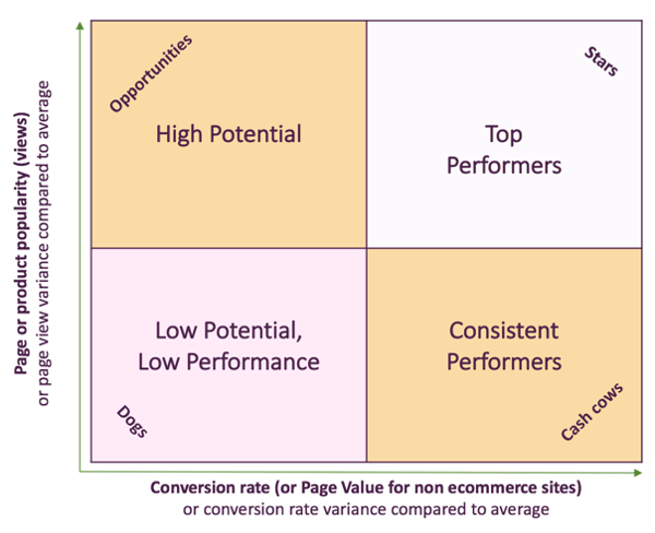
Here is a fuller walk-through of each quadrant:
Top performing content - Stars - highest reach, highest conversion rate
This is your most effective "hero" or "evergreen" content which attracts the most visits, since it attracts organically visits through inbound marketing or you promote it heavily through paid media. It is also the most effective content relatively speaking in converting visits to value measured as leads, sales or engagement.
You will often need to work hard to get more value from this content by keeping it visible in the SERPs if that is the main traffic driver. Options to make improvements in this quadrant include:
- Historical Optimisation - updating content so it stays fresh by tweaking it with the latest information or extending it , so it remains effective in the SERPs.
- Surfacing popular content - featuring the content (or products) more prominently in the customer journey, for example in panels or resources sections.
- Create related content - writing related content articles that build on and link back to the main theme.
HubSpot has used what they call ‘Historical Optimisation’ to more than double the number of monthly leads generated by the old posts they have optimised, they also increased monthly organic search views of old posts, optimised by an average of 106%.
High potential content - Opportunities - highest volume, lower conversion rates
This content is successful in attracting visits, but for some reason has lower conversion rates and often higher bounce rates than Top Performers. To get more from this content, consider:
- Improving calls-to-action - make them clearer and more compelling or simply add more in-line links if it's a blog post.
- Improving the content quality - low conversion could be a problem with the content itself, perhaps the content is too short, so isn't engaging. A retail merchandiser told me an example of where a beauty treatment product was getting great views, but lousy conversion, the reason was simply found to be a poor product shot which was easily remedied.
- The target audience - if none of these techniques give improvements, perhaps the content is attracting the wrong type of audience.
Consistent performers - Cash Cows - lowest reach, highest conversion rates
This content is effective in conversion, but not in attracting visits. Options here include:
- Increase visits using SEO - reviewing content against SEO best practices for on-page optimisation and internal and external backlinks.
- Share content regularly - ensure it's in the editorial calendar to share via social media or in e-newsletters or via partners.
- Paid media - use paid media to attract more visits to the content.
Low potential/low performance - Dogs - lowest volume, lowest conversion rates
Perhaps "Dogs" is overstating it, this is simply your average content, it can still have an impact on attracting visits through inbound marketing as long-tail content and can influence conversion. It's simply not stellar, so is less worth optimising individual content, although groups of content or page templates hosting them can be improved.
How To Create the Content Optimisation Matrix Using Analytics Data
Google's Data Studio can create the visualisation needed which was never really possible in Google Analytics. Here's an example showing the large range of content values we have for page value and page views (outliers omitted).
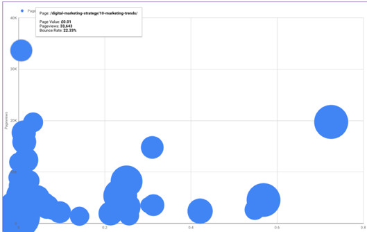
As you'd expect, the bulk of the content is in the Dogs section, but this means that it is relatively easy to focus on improvements from the other three quadrants!
Using the Google Analytics API to analyse content effectiveness changes through time
It's the nature of an audit that it gives a snapshot of performance. When doing a content audit, you should probably use an average months data, but a quarter or even six months could be better to average out seasonal fluctuations.
Once you have got a feel for your most effective and highest potential content and you're looking to optimise it to contribute more, you can repeat the analysis with the matrix. An alternative is to use relevant Top Content and Top landing pages in Google Analytics to see improvements or problems when content becomes less effective, for example a drop in organic visits thanks to a Google algorithm update or competitor activity.
An alternative is to use the Google Analytics API Google Sheets plugin to visualise changes each month. Here is a snippet of a sheet I've created to highlight problems or improvements during a monthly review:
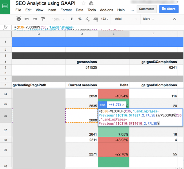
This analysis compare sessions for each page or folder (the spreadsheet rows) between two months and can be segmented by a single channel, e.g. organic or paid search.
You can see Row 38 has the biggest fall in traffic and also relatively few goal completions, so you might want to investigate why this has happened to reverse this. The benefit of using GAAPI is that you can extract data from Google to perform your own analysis to gain insight that's not really practical with Google Analytics - for example you can compare the organic and paid search contribution of each page against Facebook ads.
I hope that this article has given you some "food-for-thought" and will maybe prompt you to perform more detailed content optimisation analysis in the year ahead. Do contact me on LinkedIn if you have any questions. As always, the challenge with analysis is to make the time available to do the analysis amongst business-as-usual activities, so good luck with that!
if you'd like to find out more about the recommendations our SEO experts can make for content optimisation and auditing, get in touch today.


Let's be social
Join our growing social communities to learn more about the benefits of digital marketing and the people who make us tick.